Looking for interesting textures in the place I like least proved quite fruitful :)
Monday, 27 February 2012
Monday, 20 February 2012
French Knots
I found this incredible picture on Pinterest.
It's called One Thousand French Knots and it's by Jeana Eve Klein
I think the way the colours mix is just breathtaking.
I'm trying to draw some inspiration from it before I attempt the next stage of Project 3.
I'm not very good at French Knots :(
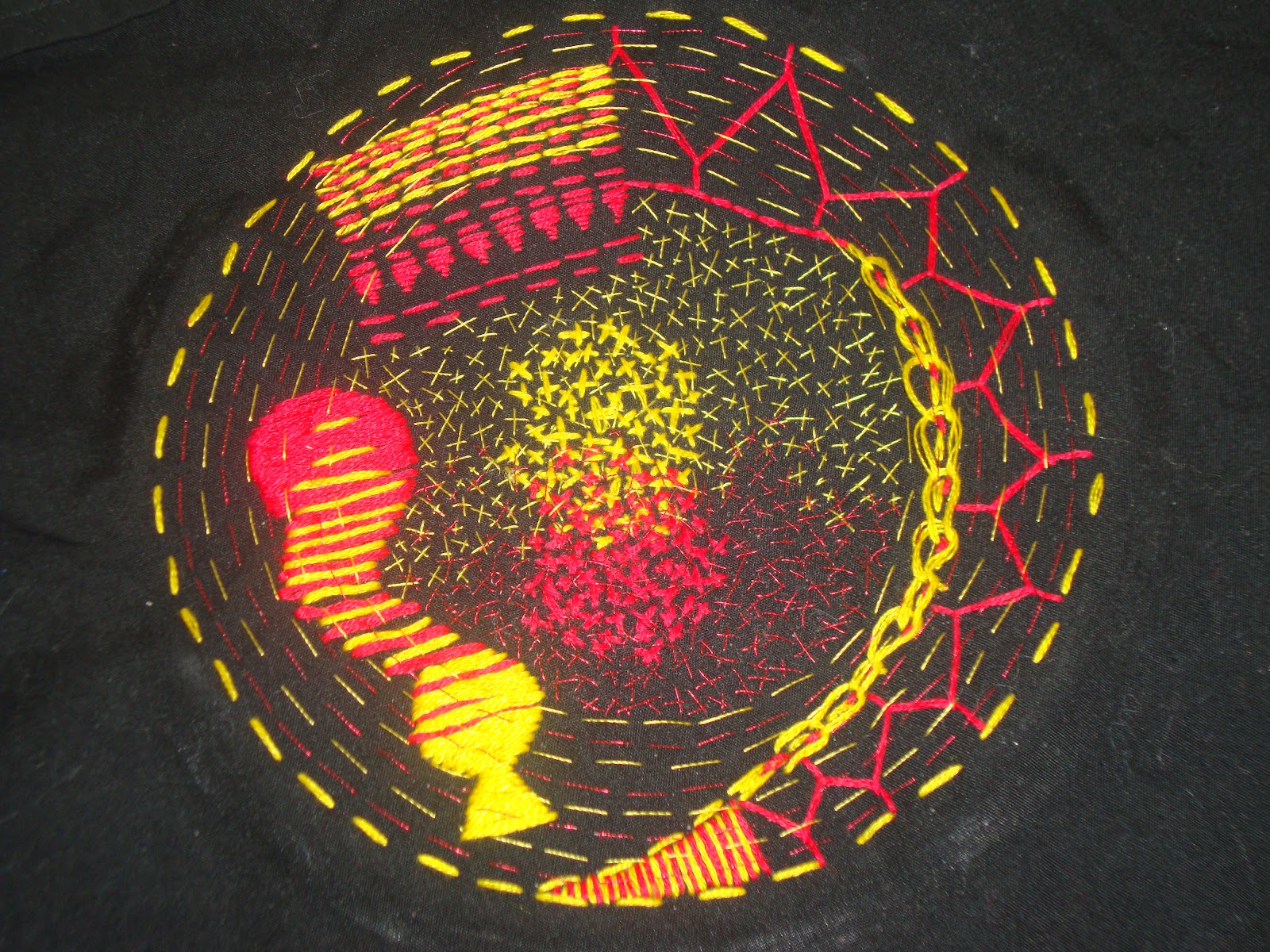
Project 3 Colour - Stage 5 Coloured Stitches
This one was a repeat of Project 2, Stage 2 but this time experimenting with mixing primary colours in different ways.
I think it was most likely finsihed after I'd done all the bits with embroidery floss, but my edit button wasn't working and I felt the need to cover all the black fabric with running stitch and tiny cross stitches. I love the way the colours seem to merge together in the satin stith and the stripes of yellow with red between them but the part I like the best is the effect that has happened with the layers of different sized and different textures and different colours of cross stitching. I also had one of those revelatory moments that was probably dead obvious but has only just come to me, because I realised that with stitching I'm not just creating a visual texture but also a physical one, I love the way that this patch of cross stitches feels and the way it makes the fabric feel thicker and more robust. I'm pretty sure I should've known that, but it was like a discovery to me. I think I could've improved it if I'd had a better red thread, I think a natural cotton thread would've shown up much better than this one which is a metallic, also that tiny row of red backstitch near the top doesn't follow the circle properly, because the circle wasn't there when I did it, and it's niggling at me. One other issue was that I was wearing a thick, fluffy oatmeal coloured cardigan and that was bad in combination with the black fabric, it kept shedding little bits all over it!
Project 3 Colour - Stage 4, Exercise 2
Colour Moods and Themes
"Identify a colour, mood or theme that you feel really drawn to."
Design for Columbine by Allan F. Vigers (1858-1921)
Produced by Jeffrey & Co. , Colour print from woodblocks, England 1898
Greetings card produced by the V&A
Project 3 Colour - Stage 4 , Exercise 1
I really like the symbolism that colours can have and so I enjoyed this exercise.
From the left the pairs of words above are - sad, happy - bright, dull - active, passive which are the words suggested in the course literature.
The words that I thought up on my own from the left are - waking, sleeping - wet, dry - verdant, barren.
Verdant is the one I like best, I love green.
Project 3 Colour - Stage 3, Exercise 4
I found it next to impossible to record the colours that I was seeing without actually painting the objects so I decided to just go ahead and do it. Although it's not terribly obvious in the photo, there were actually huge differences in the colours I used when the carrot and pear, felt ones by the way, were on different back grounds. I feel like I should've known it already, but having avoided painting in this way for a long time it had slipped past me, that using a blue background makes the shadows and reflections have a blue hue, well duh! Seems obvious now.
I think probably that I should've painted the same view of the carrot and pear from the same angle on the different backgrounds to make the colour differences more obvious.
I haven't painted in this way in a very long time and never with acrylic before and I was pleasantly surprised to discover that I actually enjoyed it :)
Sunday, 19 February 2012
Project 3 Colour - Stage 3, Exercise 3
For this exercise I chose to try and match the colours of this greetings card that I had hanging around, it was painted by an artist called Wu Minrong. I used acrylics and I'm quite pleased with how it turned out, I think the very bluest parts could have been toned down a bit though. I used soft pastels to add the colours of the little birds on top after the paint dried. It didn't really look right until I added the red Chinese letter marks on top, they really lift it. I found this more enjoyable than the fabric matching exercise, possibly just because I made a bad fabric choice though.
Subscribe to:
Posts (Atom)