Wednesday 29 February 2012

Research Point 1


 Ladies blouse, 1910 ish, maybe, I think.
She came to me by way of ebay about 7 years ago, I bought her on a whim and I really know absolutely nothing about her, so I guess I need to spend the next few days doing some researching before I sit down to write about her.

Project 3 Colour - Stage 6 , Exercise 2 continued

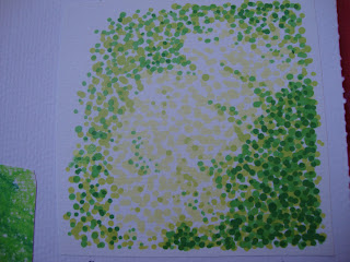
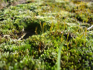
 So just when you think you're nearly finished Stage 6 goes and slips something else into the last tiny paragraph - 'Look at your drawings and sketchbook work for a drawing with pastel colours to develop in terms of image making.'  I had been so disillusioned by French Knots already, that the thought of doing more kind of made me shudder, I went off and played with the machine embroidery exercise for a bit, but not in any seriousness.  Having done that I felt refreshed enough to tackle the final part, and I had this image that I made back in Project 1 as part of a texture study of a mossy paving stone and although it's not exactly pastel colours I decided that it was close enough and pretty perfect for translating into French Knots.
 4 days and about a thousand knots later! No, really, a thousand.
I do have a tendency to just leap into things without thinking through exactly how much work they're going to take, and I think that was the case here, I never intended to create something so work intensive at this point, it's about 3 and a half inches square(ish).  I definitely got over my hatred of French Knots and became quite obsessive about them, trying to stick them in wherever I saw the tiniest little gap with fabric showing through.  I'm really pleased with it though, I think the effort was really worth it, and I'm very happy with the end result.

Tuesday 28 February 2012

Monday 27 February 2012

Project 3 Colour - Stage 6 , Alternative Exercise

I was so utterly disillusioned by the French knots that I decided to take a bit of a sidestep and do the machine embroidery exercise before I attempted any more of the little buggers.  
I hadn't ever done any machine embroidery on water soluble fabric, and I didn't really know what to expect.  I thought I would start small, just working with two colours and trying to blend them together.  I decided to stick with red and blue to see if I could create a purple effect.
The water soluble 'fabric' that I was using was like a thick sandwich bag in texture, perhaps they're all like that, but I was surprised that it wasn't actually fabric-y.  Sewing on it felt very odd, I started without any real plan or pattern in mind, I'd read somewhere that it was a good idea to have some sort of grid to hold it all together, so what emerged was a kind of cobwebby thing.  I was using red metallic in the bobbin and blue metallic on top and then half way through the bobbin ran out so I swapped the colours over.  The 'spokes' of the web were made out of lots of layers of zigzag stitch and then running stitch on top because I was quite concerned about the whole lot disintegrating when I dissolved the fabric.  Another thing that was surprising to me was how much effort I had to put in to get the fabric to dissolve, I thought it'd just melt away, but I really had to scrub quite hard at it before it went jelly like and eventually washed down the plughole.
As far as colour is concerned, which was after all the whole point, I think this is a really effective and interesting way to blend colours together, and it creates a fascinating surface.  I can see that machine embroidery will be an endlessly useful technique for making decorative details.  The finished product feels really robust and almost wire-like, although perhaps that is due to the metallic threads that I used.

Project 3 Colour - Stage 6 , Exercise 2

I love these delicate colours, I think they merge together really well, but this is a really tiny sample because I made a mistake in my choice of fabric, it was a remnent of my mum's calico curtains and it was far too thick to be trying to embroider on, so it hurt my fingers and it made me cross, it even made me decide that i thoroughly loathed French Knots and that I would stop doing them and do the alternative machine embroidery instead.

Project 3 Colour - Stage 6 ,Exercise 1

I have loved Seurat's work for a very long time, ever since I saw this painting , A Sunday on La Grande Jatte when I was living in Chicago about a thousand years ago.
So I was really eager to start exploring a stitching technique that offered the opportunity to recreate the technique of pointilism in textiles.  I realised quite quickly that it wasn't going to be as easy as I had imagined.  The French Knot and I do not get on very well at all.  

This is my attempt at the first exercise in this stage, it took me a very long time, I don't think it's very good and I really don't like it.  The only good part was when my tiny boy said, from the other side of the room, whilst looking at it, 'Ooh, it's all purpley.'  so I'm pleased about that.  I think the patch of knots in alternate blue and red work really well to create the illusion of seeing purple, the tripes less so, but I think over a larger area they would also be effective.  I also love the texture that using the big chunky tapestry yarn created.

Texture in the Park


Looking for interesting textures in the place I like least proved quite fruitful :)

Monday 20 February 2012

French Knots


I found this incredible picture on Pinterest.  
It's called One Thousand French Knots and it's by Jeana Eve Klein
I think the way the colours mix is just breathtaking.
I'm trying to draw some inspiration from it before I attempt the next stage of Project 3.
I'm not very good at French Knots :(

Project 3 Colour - Stage 5 Coloured Stitches

This one was a repeat of Project 2, Stage 2 but this time experimenting with mixing primary colours in different ways.


I think it was most likely finsihed after I'd done all the bits with embroidery floss, but my edit button wasn't working and I felt the need to cover  all the black fabric with running stitch and tiny cross stitches.  I love the way the colours seem to merge together in the satin stith and the stripes of yellow with red between them but the part I like the best is the effect that has happened  with the layers of different sized and different textures and different colours of cross stitching.  I also had one of those revelatory moments that was probably dead obvious but has only just come to me, because I realised that with stitching I'm not just creating a visual texture but also a physical one, I love the way that this patch of cross stitches feels and the way it makes the fabric feel thicker and more robust.  I'm pretty sure I should've known that, but it was like a discovery to me.  I think I could've improved it if I'd had a better red thread, I think a natural cotton thread would've shown up much better than this one which is a metallic, also that tiny row of red backstitch near the top doesn't follow the circle properly, because the circle wasn't there when I did it, and it's niggling at me.  One other issue was that I was wearing a thick, fluffy oatmeal coloured cardigan and that was bad in combination with the black fabric, it kept shedding little bits all over it!

Project 3 Colour - Stage 4, Exercise 2

Colour Moods and Themes

"Identify a colour, mood or theme that you feel really drawn to."

 Design for Columbine by Allan F. Vigers (1858-1921)
Produced by Jeffrey & Co. , Colour print from woodblocks, England 1898
Greetings card produced by the V&A

Project 3 Colour - Stage 4 , Exercise 1

 I really like the symbolism that colours can have and so I enjoyed this  exercise.
From the left the pairs of words above are - sad, happy - bright, dull - active, passive which are the words suggested in the course literature.
 The words that I thought up on my own from the left are - waking, sleeping - wet, dry - verdant, barren.
Verdant is the one I like best, I love green.

Project 3 Colour - Stage 3, Exercise 4

 I found it next to impossible to record the colours that I was seeing without actually painting the objects so I decided to just go ahead and do it.  Although it's not terribly obvious in the photo, there were actually huge differences in the colours I used when the carrot and pear, felt ones by the way, were on different back grounds.  I feel like I should've known it already, but having avoided painting in this way for a long time it had slipped past me, that using a blue background makes the shadows and reflections have a blue hue, well duh! Seems obvious now.
 I think probably that I should've painted the same view of the carrot and pear from the same angle on the different backgrounds to make the colour differences more obvious. 
I haven't painted in this way in a very long time and never with acrylic before and I was pleasantly surprised to discover that I actually enjoyed it :)

Sunday 19 February 2012

Project 3 Colour - Stage 3, Exercise 3


For this exercise I chose to try and match the colours of this greetings card that I had hanging around, it was painted by an artist called Wu Minrong.  I used acrylics and I'm quite pleased with how it turned out, I think the very bluest parts could have been toned down a bit though.  I used soft pastels to add the colours of the little birds on top after the paint dried.  It didn't really look right until I added the red Chinese letter marks on top, they really lift it.  I found this more enjoyable than the fabric matching exercise, possibly just because I made a bad fabric choice though.

Project 3 Colour - Stage 3, Exercise 2


In retrospect, choosing a fabric with a billion colours on it for a colour matching exercise wasn't the best idea.  On the top row the paint to the left is just normal half pan watercolours and to the right it's acrylic, of the two I think I achieved better results with the watercolour but I wasn't entirely happy with either attempt which is why I went on to make another one underneath made up of, watercolour inks on the left and gouache on the right, I think the gouache is a more accurate match for the bright colours of the fabric, and it would've turned out better if I'd been patient enought to let it dry between stripes! The watercolour inks gave a much more subtle result but it's the one I like the best.

Thursday 16 February 2012

Project 3 Colour - Stage 3 , Exercise 1

Yay! Time to get out the paints and start playing.

I ran through some mixing techniques with different media.
Firstly watercolour -

 From the bottom row up, because I put the photo in upside down, pure colour, diluted with water, mixed with black, mixed with white and mixed with grey.

In this one I concentrated on using deep red watercolour ink and exploring all the different shades I could achieve with it.  From the top, diluting gradually with water, adding white, adding black, adding grey and then on the bottom row I spaced out for a while and added blue to it, completely forgetting that green is actually reds complimentary colour, Doh!
 I moved on to acrylic paint next, again from the bottom up, pure, dilute with water, white paint added, grey paint added, black paint added, complimentary colour added, it was after I painted the first row that I remembered that the compliment to red is green so this one is also in blue, oh dear!
I used deep violet acrylic in this one, again adding water, white, grey, black and then orange as the compliment.

I feel like I'm saying it a lot, but this exercise was a really good reminder for me, it's a long time since I've sat down and really thought about colour and how to  create the one I need.

Project 3 Colour - Stage 2, Exercise 2


I struggled with this one a bit, I stared and stared and stared and I just don't see it.  I suspect that maybe the grey paper is not the right shade of grey, but it seems to be next to impossible to buy grey paper in town.  I understand what I should be seeing and why so I'm just going to leave it at that for now and if I come across grey paper on my travels I shall try again.

Project 3 Colour - Stage 2 , Exercise 1


I can't decide whether these photo's are just lit slightly differently or if the different colour perceptions are showing up really well, I suspect it's the former.  To the naked eye, the difference is definitely there but it's quite subtle.  I think it was quite an important lesson for me to revisit, I have spent the last few years avoiding using many bright colours, often limiting myself to black and white, I think I was a bit scared of it, but I'm feeling more and more comfortable with it the more of these exercises that I do :)

Project 3 Colour - Stage 1


I feel a bit like I've done one of these colour wheels anytime I've undertaken any sort of creative learning from Primary school upwards, so I spent a good ten minutes huffing and hawing and prevaricating and rearringing everything and thinking I really couldn't be bothered and then I got over it and started and really enjoyed doing it as I always have.

I made three different wheels, using, from left to right, Aquatint pencils, Watercolours and Oil Pastels

So gorgeous I could just.....


......pass out, is what I said, vomit is what Beardy said.
This awesome sugar, pigment and 'stuff' creation by Australian artists Pip & Pop blows my mind but the photographs on their website are a squillion times better, I just long to be able to shrink down to the size of a lego man so I can live in one of their wonderful worlds!

Check them out and then go and play in the most gorgeous interactive web experience I have ever seen We Miss You Magic Land

Sketchbook 2


I think I really have to get some more colour into this book!